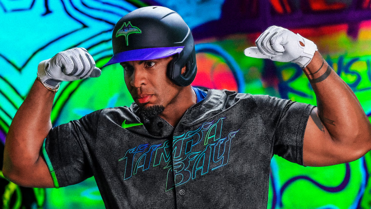
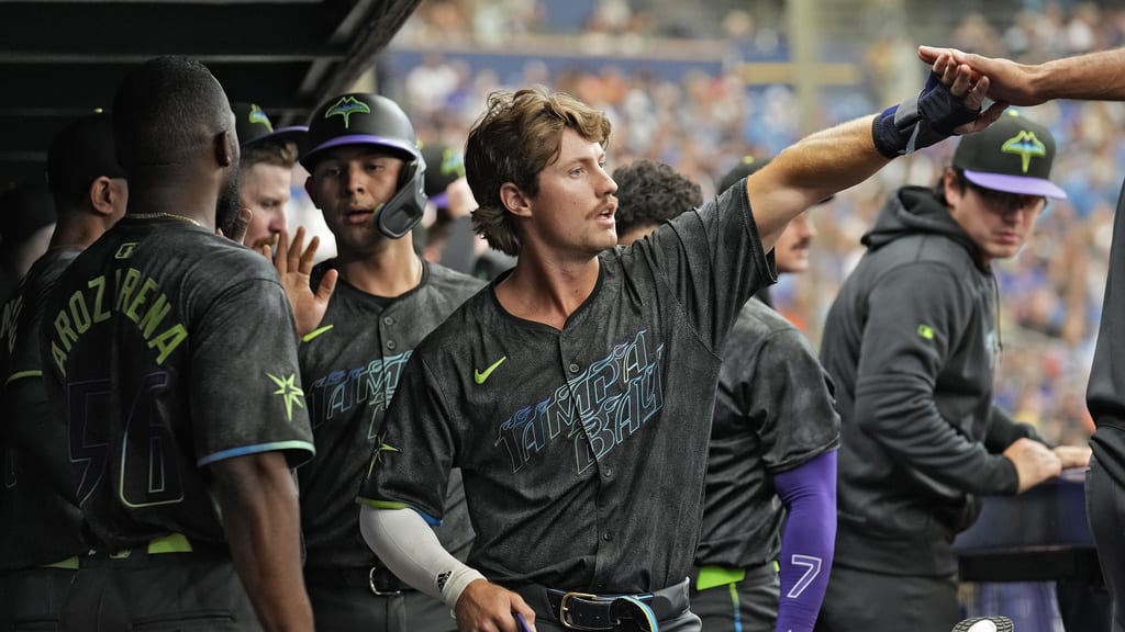
Grit and Glow, The Tampa Bay Rays City Connect Jerseys have been released in part of Major League Baseball’s and NIKEs city connection editions. These jerseys have taken the league by storm, with fun and excitement. City Connects are put out to help teams put a new touch in play with fans in the city by wearing a new emblem on their jersey. It is a way to give baseball fans a different look with a fun and vibrant feel. The colors on the jersey represent the team’s grit on toughness but with shines of new excitement in baseball.
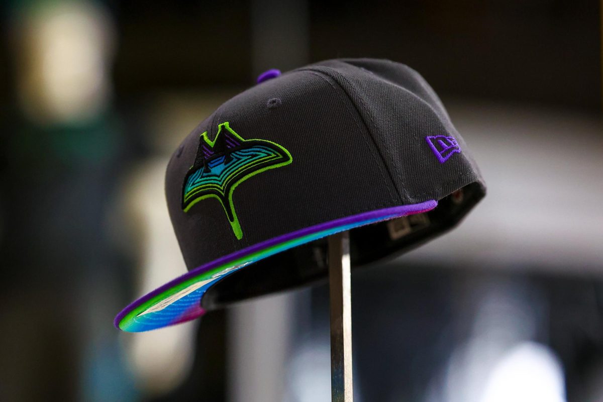
The Rays featured several minor connections to all of Tampa Bay, like featuring “Tampa Bay” on the front on the jerseys for the first time since 2007. They connected the team to St. Pete with a Pelican logo on the pants of the uniform. The logo has palm trees in the back as a fixture to the St. Pete city flag and the beach town the bay area is. Along with more small connections, the Rays kept a very “Tampa Bay Rays” feel to the uniform, with the hat featuring the fan titled name “SkyRay” and a Skyway bridge logo in the shape of a Ray (pictured below). The “SkyRay” is to help show how the bridge and bridges connect Tampa, Sarasota, Brandon, Clearwater, and St. Petersburg. Radio host at 95.3WDAE & AM620 Zac Blobner mentioned his love for the connection, saying, “‘Tampa Bay’, lettering on the front literally connects the city of St. Pete and Tampa, which is awesome.”
The Rays also released the “SkateRay”, a fun logo for the fans to match with the other logos. The “SkateRay” is to show for the main theme of the jersey of the skateboarding life in St. Petersburg. It matches the tough looking skate marks on the inside of the jersey numbers, outlined by bright colors to show the glitz and gaudiness of St. Petersburg. Bright colors also represent graffiti art all throughout the city. The wear and tear on the black is to show how the sun beams down on the toughness of Tampa Bay and would affect a T-shirt of this color. It is called an “underground” color, to show how the Rays can be left as underdogs and left behind but will fight through and find a way to succeed. Zac Blobner spoke to this when he said, “Personally, I’m a big fan of the new jersey and love how their design captures the rebellious spirit of the Franchise.” The colors combined make the jersey create a glow in the dark feature. Glow in the dark seemed to be a fan favorite as Steinbrenner Junior Baseball player Kason Bell stated, “I love the glow in the dark features it has all around.”
The Rays were the third team to release the edition this season, and fan reactions have been through the roof. Not only have fans been reacting, but the players have also had a boost. Tampa Bay was 14-18 before they wore the uniform for the first time, when they announced they would be wearing them 15 times this season. When the team wore them the first weekend in a series against the New York Mets, the Rays would sweep the series, getting themselves one game short of an even record. The players apparently loved the vibe, they lobbied to wear them the next day in the opening game against the Chicago White Sox. Baseball superstitions stood true as the Rays would win 8-2 and even out their record at 18-18.
The Tampa Bay Rays would be able to wear the City Connect Jerseys again against the Chicago White Sox and win in them again. Pushing themselves to a 19-18 record and 5-0 in the uniform. These jerseys have brought a new feel and excitement to a team that very much needs it. Zac Blobner believes they have helped the team quoting, “These City Connect Uniforms made the Rays COOL again, but winning in them, made the Rays GOOD again.” With the pops of color and the small detail, the Rays design team had over four years of work, for what has become a fans favorite jersey in the bay area and league, as Freshman Zach VanHoose saying, “they tap in with the cities skateboard culture and glow in the dark give a nice touch.” Tampa Bay looks to keep using the uniform as a move in the right direction and a boost toward a 6th straight postseason appearance.

