Color Theory
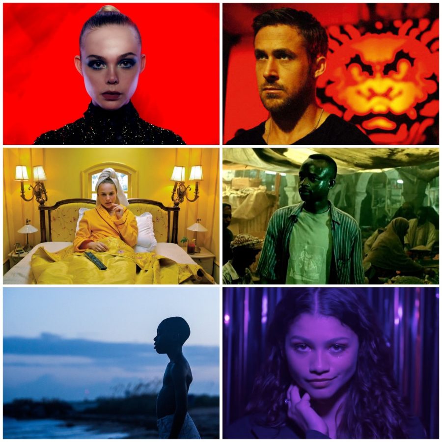
Color can influence an audience’s emotions through aesthetic decisions, clothing, and objects. Directors and cinematographers did not have to think about color schemes when shooting motion pictures during the black and white era of filmmaking. However, Thoughts on directing and cinematography had to change once it was feasible to make movies in color, giving rise to the idea of the movie color palette.
Color first appeared on the big screen for the first time 94 years ago, sparking a cinematic revolution. After years of only being able to tell stories in black and white, a century of filmmakers has since embraced this contemporary, vibrant method of storytelling. But pigment volume has recently been turned up to the highest setting and has become a vital tool for expression and emotion in entertainment.
What is color theory?
According to color theory, different hues can cause viewers to experience particular emotions during a movie. As a director or cinematographer, you can instantly set the tone for your movie by adjusting the colors, which will help you tell your story. Different color contrasts and combinations are said to affect the viewer. The color scheme used in film can be complementary, analogous, or monochromatic. Complementary color schemes involve using colors opposite each other on the color wheel, while analogous color schemes involve using colors next to each other on the color wheel.
Monochromatic color schemes involve using shades and tints of a single color, creating a sense of uniformity. Filmmakers can change the colors in their movies in addition to using color schemes by using color grading. This can be done to set a particular tone, such as desaturating a movie to convey a sense of gloom or boosting the color saturation to convey excitement.
Complementary color schemes
Complementary color schemes are used to infuse the frame with life. On the color wheel, complementary colors are located opposite one another and create a contrast. Both colors mixed together produce a visual contrast and an optical effect that makes one appear brighter than the other.
For instance, many blockbuster movies frequently use the complementary colors orange and teal in their color schemes. Conflict on the inside or outside is frequently associated with opposing colors. Complementary colors combine warm and cool colors to create a high-contrast, vibrant tension in the film, regardless of the color scheme chosen.
La La Land (2016)
Monochromatic color scheme
Utilizing a base hue or a family of base hues before adding tints, tones, and shades is known as a monochromatic color scheme. By blending the pure hue with white, black, or another nearby color, the tints and tones are produced. Depending on where it falls on the spectrum, each tint, tone, or shade is assigned a number. While a monochromatic color scheme is entirely based on a single color, it is important to remember that this does not necessarily mean that it is based on a single shade.
The secret to giving an image depth and appeal is to vary the shades by altering the brightness and saturation of the base color. Monochromatic hues are ideal for evoking tranquility and peace. They can also be used to give the impression that a space is bigger or more open.
The matrix (1999)
Analogous color schemes
A group of hues that are close to one another on the color wheel is referred to as an analogous color scheme or analogous color sequence. Colors that are next to each other on the color wheel are used to create analogous color schemes. Analogous colors in movies can be distinguished by looking at a scene and then comparing the colors in the frame to those on the color wheel. Your film’s design will feel more cohesive if you use analogous colors throughout. Any scene will automatically appear to the eye as a component of a larger whole because it is composed of numerous parts that work well together.
Similar hues are frequently seen in the natural world. When viewed side by side, colors that are close to one another on the color wheel look cozy and pleasant. Similar hues are also frequently seen within nature. When viewed side by side, colors that are close to one another on the color wheel look cozy and pleasant.
Moonrise Kingdom (2012).
Why is color theory so important?
In movies, color can be used to highlight specific plot points and distinguish between characters. For instance, the use of black and white along with a touch of red helped to create a sense of urgency in the film Schindler’s List. However, color theory is also used by filmmakers to highlight certain facets of a character’s personality. For instance, villains in movies are frequently shown wearing dark, moody colors like black, while heroes are usually shown in lighter, happier hues. Cinematic color palettes have a direct impact on how viewers perceive a film. Ambience, emotion, and symbolism can all be enhanced just by a wide variety of tones and color.
Your donation will support the student journalists of Steinbrenner High School. Your contribution will allow us to purchase equipment and cover our annual website hosting costs.

Madeleine is a freshman at Steinbrenner and a first time Oracle Staff Writer. In their free time, they like to roller-skate and watch movies.


